Last week we paid a visit to our friends at Brindisa Borough Market to see our latest uniform project in action.
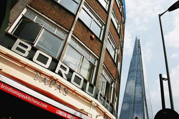
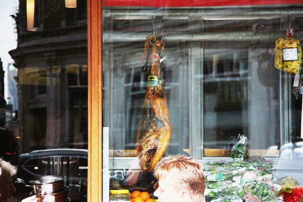
Brindisa takes its name from the Spanish word brindis meaning to raise one’s glass or toast. For 28 years, the giants of Spanish tapas have brought the finest foods of Spain to London, celebrating the country’s culture and landscape. It’s hard to imagine now, but when the restaurant launched in 1988, knowledge of Spanish cuisine was rare in the UK. With a mission to bring Spanish gastronomy to Britain, founder Monika Linton launched Brindisa, now synonymous with the best Iberian food London has to offer, with restaurants in Borough, where we visited, as well as Shoreditch, Kensington and Soho.
Throughout the development process it was clear that Brindisa wanted to avoid any typical Spanish clichés. The uniforms were to give a nod to a Spanish aesthetic without exploiting typical notions; the colours of red and yellow, for example, while significant, were to be avoided in order to dodge stereotypes.
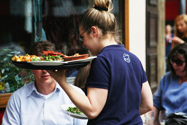
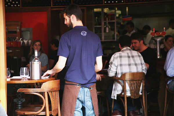
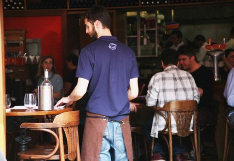
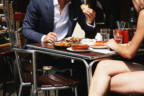
Instead, we focussed on the subtle and inspiring interiors of Brindisa – the warm colours of the decor, rich tones of Rioja and the colours of the numerous tapas dishes Brindisa purvey.
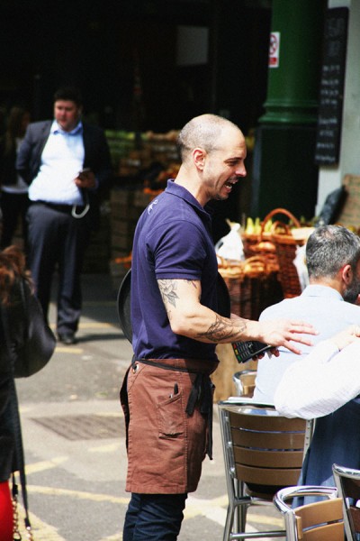
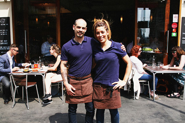
The result is a bespoke half apron in a deep paprika tone, worn around the waist and complete with utility pockets and black tie. The complimentary polo shirt in a royal blue features the triumphant bull logo embroidered on the reverse.
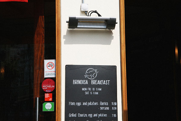
Staff wear the uniform across Brindisa’s locations – for more information and to whet your appetite with their menus, visit the website.
All photography by Matt Bramford for Field Grey