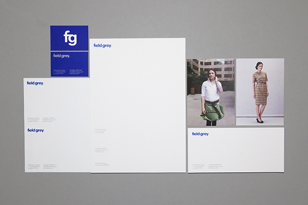
Over the last 12 months we’ve been working with long-term Field Grey collaborator and graphic designer Tom Mower on a new identity and website for the company. The aim of the new identity is to meet our new ambitions and aspirations for growth.
What led to the redesign and what were we aiming to achieve through the new design?
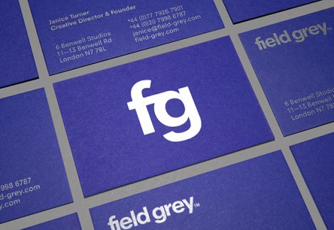
The original logotype and stationery were created by Sean Perkins at North Design. Many of the qualities of the original logotype remain the same today. Field Grey specialises in uniform design: it is not a brand, clothing label or fashion design studio in the classical sense. We pay a great deal of attention to the wearer of a uniform as well as the uniform’s broader semiotic function and relationship with its associated brand or service. We strive to make uniforms that look good and feel good to wear.
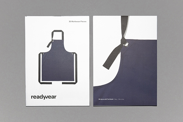
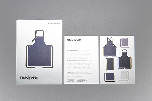
Whilst Field Grey’s core principles remain the same, we have grown in the last 10 years and have plans for further growth through projects like the recent launch of Readywear. This new collection needed to be positioned as a distinct ‘off-the-peg’ collection separate from the studio’s commissioned work and projects.
The new identity needed to provide a platform and voice for new growth, such as Readywear, while retaining the same intrinsic values and principles of a Field Grey uniform. Also, from a practical perspective, our digital presence has expanded greatly and this needed be reflected in the design of our new identity.
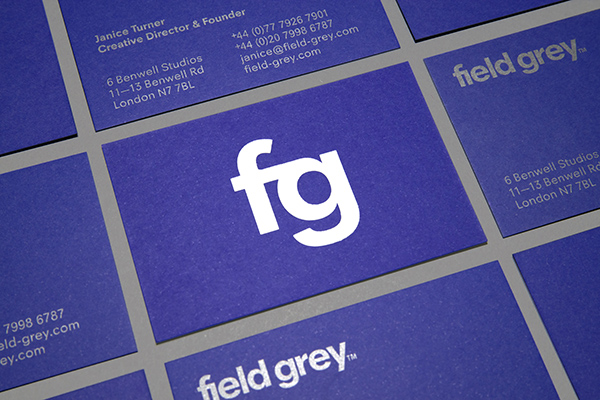
What’s behind the design of the logotype?
It was never really a question of starting from scratch or looking for an entirely new identity, but what was clear from the outset was the desire to create an approachable, warm and less authoritarian voice for the studio, to match our expanding client base and digital growth. It is an identity that was aiming to communicate notions of efficiency and dependability.
Many of the studio’s more recent projects are, in a sense, about debranding the uniform and making uniforms that are primarily desirable to wear. They communicate a brand message through the use of colour, fabrics or garment construction – through subtler means of brand recognition than logos emblazoned on t-shirts. Projects like the Hawksmoor apron do not present an authoritarian, rigidly consistent aesthetic but one that is more casual and comfortable; an extension of what the staff would choose to wear. The apron design relays the brand’s message rather than wearing it as a logo or slogan. It was ideas and principles like this that our new studio identity was trying to connect with.
The new logotype and broader look and feel of material needed to be in line with this philosophy of design; an identity that was attention seeking would have been the entirely wrong approach.
How does the design accommodate the future aspirations of the studio?
During the process of designing the identity and new website, we were also working on Readywear, a collection of 36 workwear pieces which launched at the London Design Fair. The logotype would need to allow for at least one new name (at this stage) that is as distinctive, but also part of the same family.
We began by approaching the creation of this set of names through language, looking at wording and grammar that would be individually recognisable but also feel related to each other. The use of all lowercase in the names ’field grey’ and ‘readywear’ aimed to be as efficient with language as possible, while being warm and approachable at the same time. By not using uppercase, the mark instantly becomes more informal. By creating a blend word with ‘ready’ and ‘wear’ we have a name that is more of a memorable label. This wording was produced in the typeface Neuzeit Office, a slightly more open and geometric typeface than Helvetica (the typeface used in our original logotype).
This reductive approach continued through to the creation of the ‘fg’ and ‘rw’ monograms for our social media platforms.
More recently our work has reached out into digital platforms, reporting on uniform design and broader trends in fashion and clothing; it was important that the redesigned identity provided a platform for this activity as well.
Overall the new identity aims to be relatively restrained, to know it’s place and perform much like a successful uniform understands its relationship with its’ brand.
Tom Mower is a graphic and web designer you can see more of his work here.