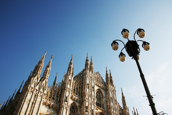
Our ossessione with all things Italian design reached record heights this weekend when Field Grey took a field trip to the Italian fashion capital, Milan.
We enjoyed plentiful quantities of Campari and canneloni, and with world class museums and galleries in every suburb of the city, we had a lot of inspiration to choose from.
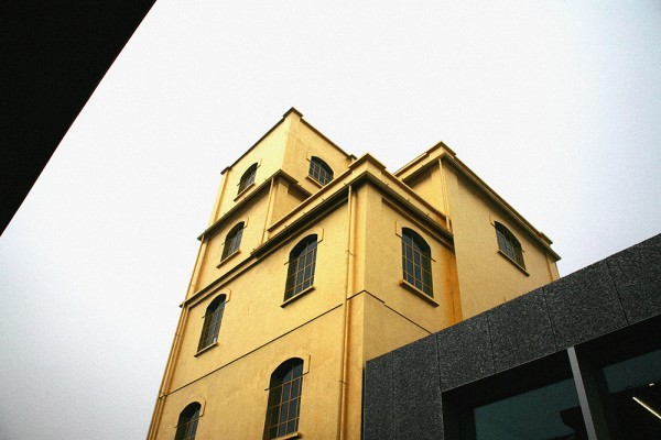
First on our list was the recently launched Fondazione Prada, a permament home for Miuccia Prada’s art foundation in the Largo Isarco suburb. With the help of architecture practice OMA, headed by Rem Koolhaas, an old distillery has been transformed into a myriad of exhibition spaces. A rotating exhibition programme features a range of international art.
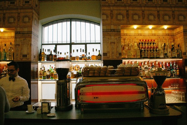
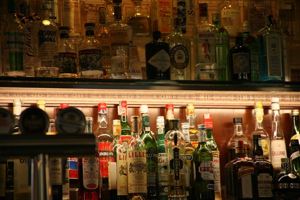
One of the highlights at Fondazione Prada is a visit to Bar Luce, the gallery’s grand café. Designed by Wes Anderson, the café boasts formica seating as seen in Castello Cavalcanti, wallpaper inspired by the Galleria Vittorio Emanuele II (we’ll get to that shortly) and an array of Italian delicacies old and new.
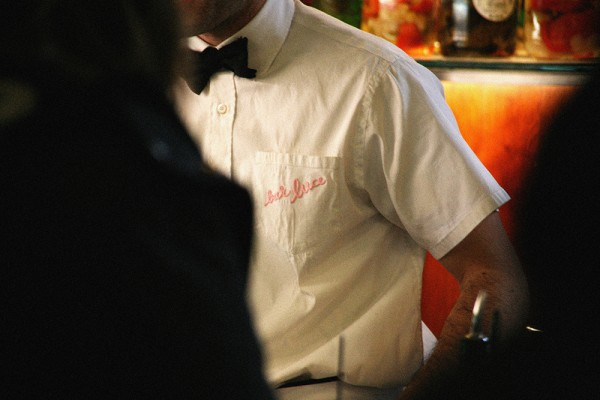
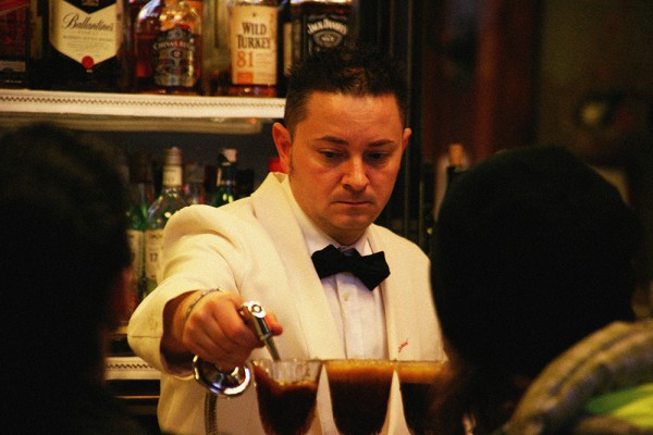
The uniforms aren’t as exciting as we’d hoped, particularly going on the illustrious costumes in Anderson’s films. They’re in keeping with the mid-century Milan theme, though; staff wear crisp white shirts with embroidered pastel Bar Luce logos, teamed with black bow ties.
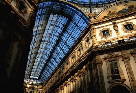
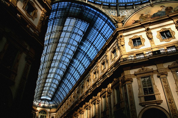
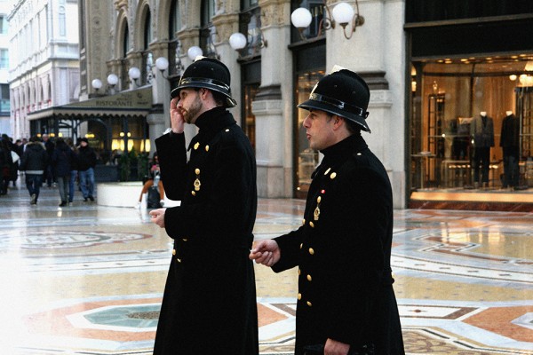
The Galleria Vittorio Emanuele II, one of the world’s oldest shopping destinations, was conceived in the 1800s. Milan’s most acclaimed fashion houses retail there, including Prada, Gucci and Armani. Gents patrol the Galleria in long, black overcoats with traditional, lavish, gold buttons.
A must see was a visit to Mercatores, Milan’s oldest uniform design company. Since 1943, Mercatores has created exceptional uniforms for waitresses and hospitality in general. It prides itself on expert craftsmanship and traditional techniques and has clients globally.
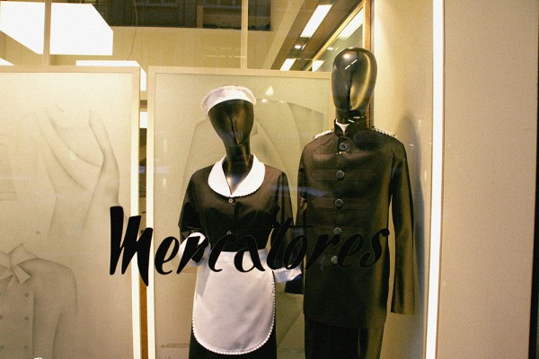
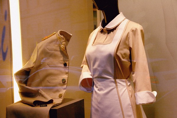
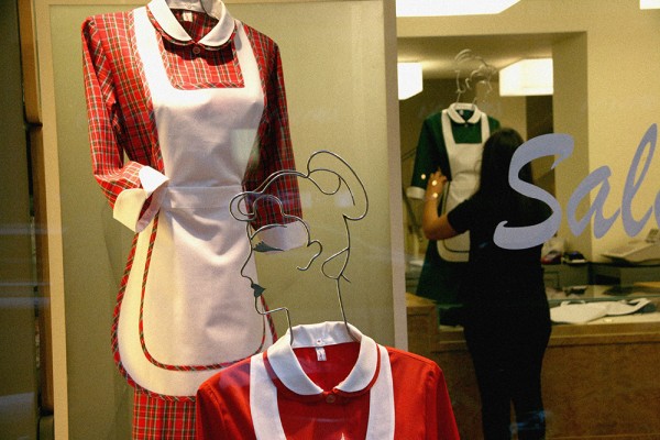
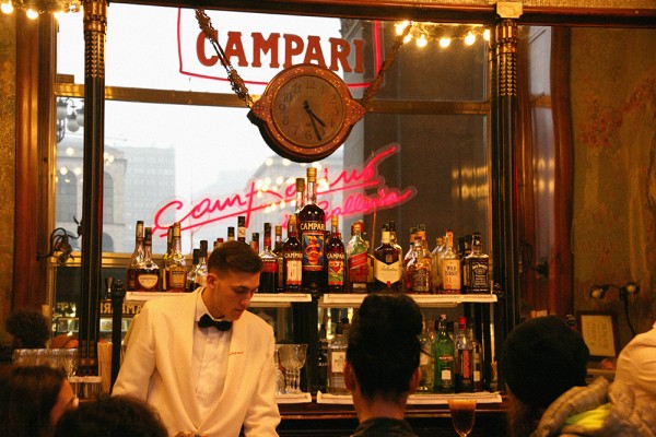
At the Camparino in Galleria, at the Duomo entrance of the Galleria Vittorio Emanuele II, waiters wear classic, old-school waiting uniforms – Anderson’s Bar Luce designs are not dissimilar. Rumour has it Verdi and Toscanini imbibed there and the Art Nouveau interior is incredible. It’s the perfect place to enjoy a Campari at the bar with a buffet of pickled onions (!) and olives.
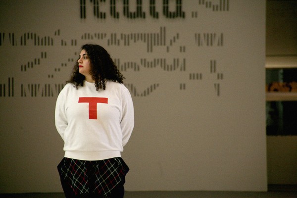
On to the Triennale di Milano, a major art and design museum situated in the centre of Parco Sempione. In this and many of Milan’s museums, staff wear graphic uniform designs. At the Triennale, team members wear white sweatshirts with big red ‘T’s.
The Triennale regularly hosts four exhibitions dedicated to the work of Italian artists and designers old and new. We enjoyed shows about the Italian kitchen over the decades (with examples by Bialetti, Sottsass, Alessi and more), an exhibition about the urban planning of Italian cities, a selection of Italian modern art and, most appropriately, a show dedicated to the current crop of Italian fashion designers. This explored advancements in technique that many Italian houses are experimenting with. Highlights included:
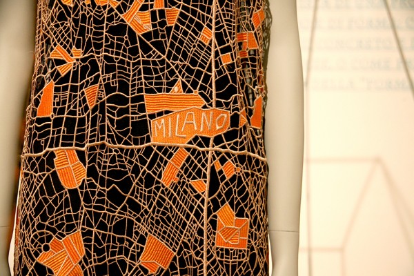
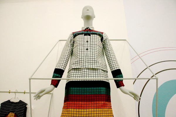
MGSM’s macramé dress, with a graphic, woven pattern based on Milan’s infastructure:
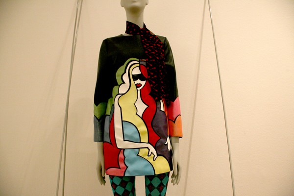
Au Jour Le Jour dress created with multicoloured leather:
Flavia La Rocca shirt dress made from 60% recycled plastic bottles:
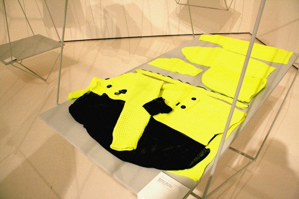
Gentucca Bini (whose workwear collection we featured) fluro knitwear collection, with each garment complimenting each other:
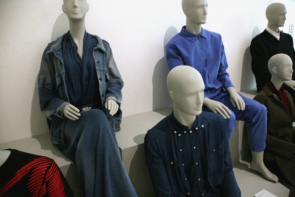
Sansovino 6’s workwear, mixing the aesthetic of denim with the comfort of knitwear:
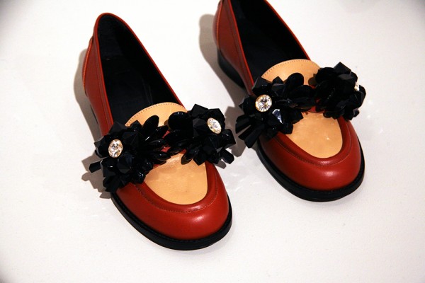
Kittima leather slip ons with Swarovski crystal embellishments:
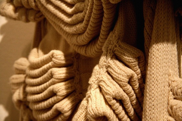
Carlo Volpi’s dramatic knitwear, with mutiple knits woven in a single piece:
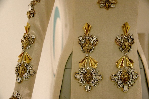
Fausto Puglisi’s breathtaking couture with metal and crystal embellishments:
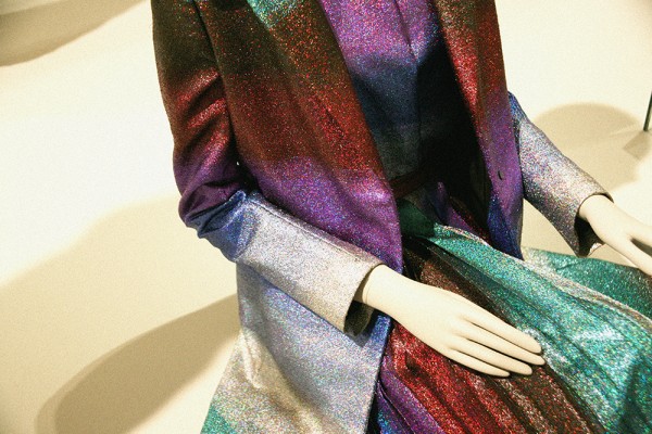
Marco de Vincenzo’s incredible lurex jacquard:
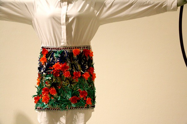
More from MSGM, with this Tiki-inspired shirt-dress decorated with hundreds of delicate flowers:
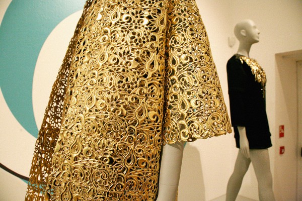
Gianluca Capannolo’s gold laser-cut jacket:
To read more about the exhibition, visit the Triennale de Milano website.

