Recently we discussed the curious business of branding individual sports stars after the launch of Andy Murray’s own personal logo. It is often fundamental to our design process to consider the range of uses that a client’s brand affords; this could include anything from implementing a brand mark as an embroidered feature through to incorporating brand colours or features into the cuts and designs of our projects.
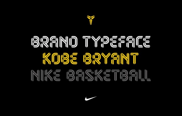
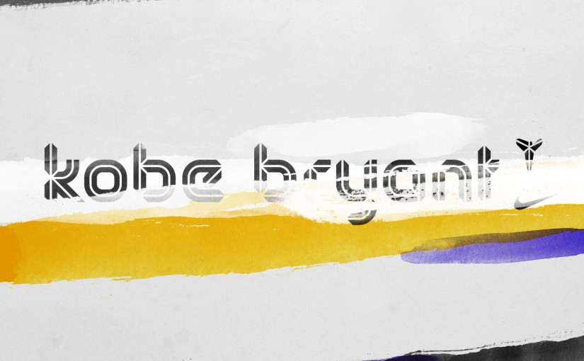
With this in mind, we were thrilled to see our neighbours Sawdust had been tasked with the challenge of creating a bespoke typeface for Nike’s products associated with NBA basketball star Kobe Bryant.
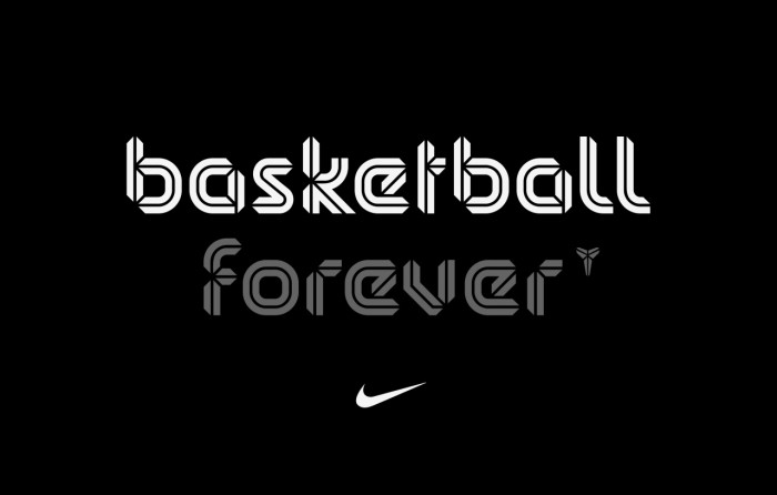
Sawdust approached the challenge with the same energetic process as they have for a stunning roster of clients including Wired, Audi, ESPN and Coca-Cola. Nike and Bryant already had a custom logo which cleverly suggested the markings of a basketball and this formed the basis for Sawdust’s typeface. “We worked closely with the designers at Nike to realise something that is unique, versatile and very much on brand with Kobe Bryant as a Jordan-signed player,” Rob Gonzalez of Sawdust told It’s Nice That.
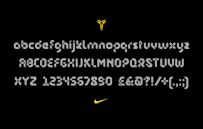
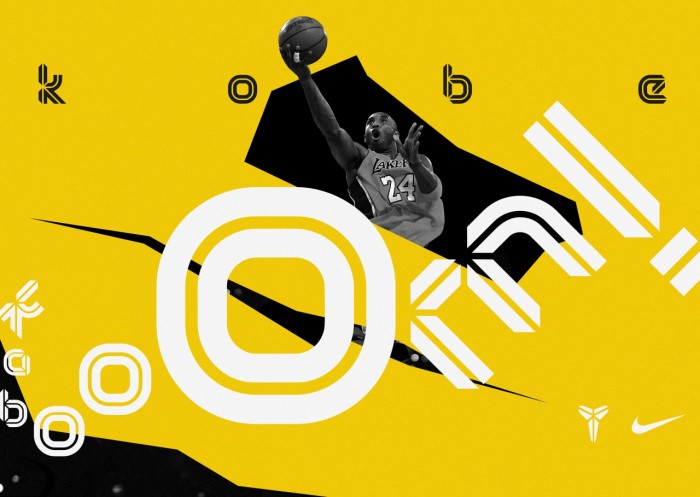
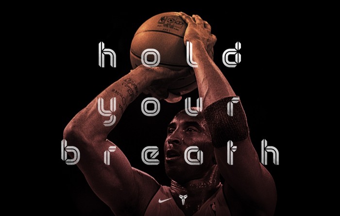
It cleverly makes use of negative space which runs through each lowercase letter. The font will be used across a range of print and digital platforms.
Images courtesy Nike/Sawdust.

