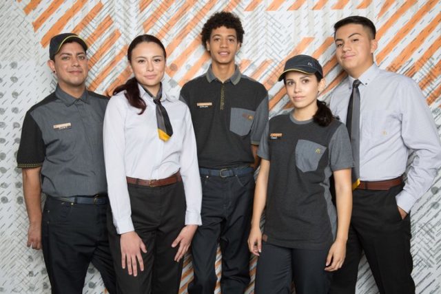
Fast food giant McDonald’s unveiled brand new uniforms this week as part of the company’s ‘continued effort to refresh the restaurant experience’. The new designs by Waraire Boswell and Bindu Rivas will launch across the US this month, eventually appearing in all 14,000 restaurants.

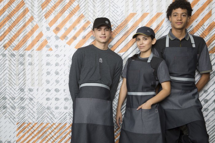
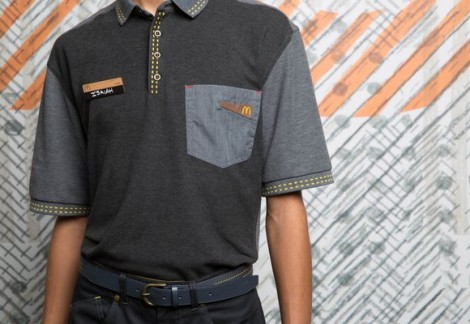
The new uniforms are a stark contrast to the previous offerings (particularly Hemingway’s retro-inspired UK designs). The range is made up entirely of modern grey pieces – from tops to trousers – in a shift towards a more contemporary look.
“Our new collections focus on comfort, fit, functionality and contemporary professionalism, delivering a uniform that crew and managers will feel comfortable to work in and proud to wear,” said Jez Langhorn, McDonald’s Senior Director of HR.
We love the utility apron (of course) that can be worn full or half; this allows staff to customise their look.

The contrasting grey-on-grey stripes look great, and compliment the rest of the chic uniform – which even includes an airline-inspired geometric scarf for hospitality staff members. Discrete hints of yellow, the brands signature colour (of course), appear through bold stitching patterns.

The uniforms have been mercilessly mocked on Twitter, however, with users drawing comparisons to sci-fi films like Star Wars and The Hunger Games:
Hey @McDonalds . About your new uniforms. Did you get your inspiration from the First Order? pic.twitter.com/uk6iIFZz74
— afifah (@fifahzulkifli) April 22, 2017
Meanwhile at new @McDonalds uniform showcase pic.twitter.com/scvDZzE1cd
— Charles FLEXavier (@BIGGSEXXXY77) April 22, 2017
What do you think?
All images courtesy McDonald’s

