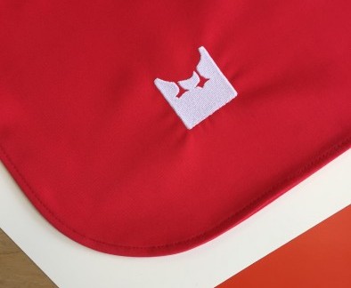
The latest Field Grey project launched this week with a bespoke solution for London’s latest opening: Duck & Waffle Local. Here we take a look at the project, from the brief through to result.
The Client
Duck & Waffle Local is the sister restaurant of the already iconic Heron Tower original, but with a ‘fast casual’ philosophy. The Duck & Waffle Local team have created a sociable, relaxed and communal atmosphere at the venue on Haymarket at Piccadilly.

The Brief
Duck & Waffle Local is the first duck-driven fast casual restaurant concept with global ambition. A youthful, open and relaxed concept, Duck & Waffle Local required a more casual uniform solution.
Wearability is key, with durable, stain-resistant fabrics. The playful ethos of the brand and the venue were also key factors to consider throughout the design process.
Development
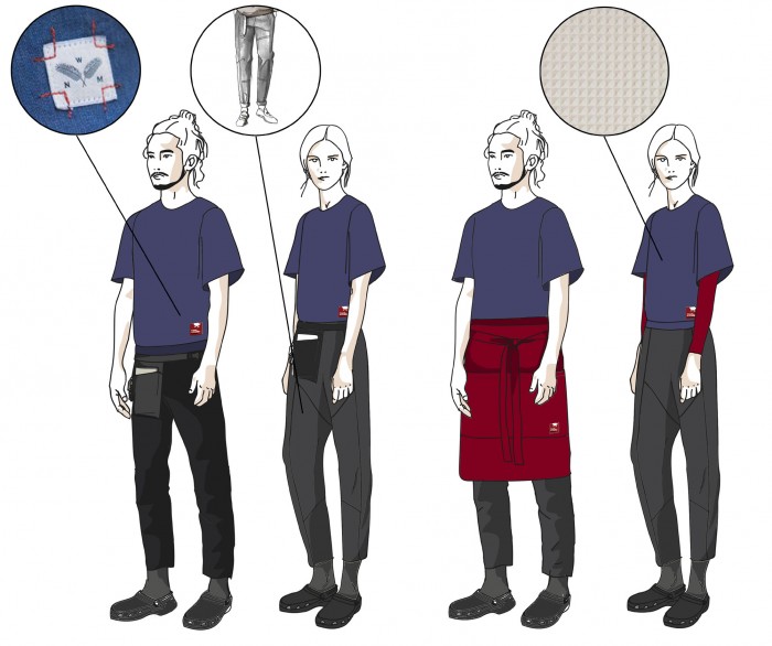
As part of the development process, we researched a number of areas, from sports-luxe fashion to traditional utility garments. We explored this area because the farm, and in particular barns, were a big inspiration for the interior design of the new restaurant. We explored workwear and utility pockets, futuristic fabrics and the history of denim.
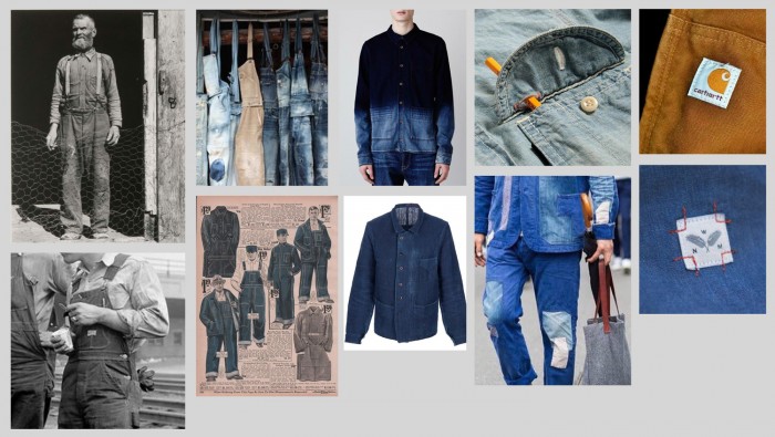
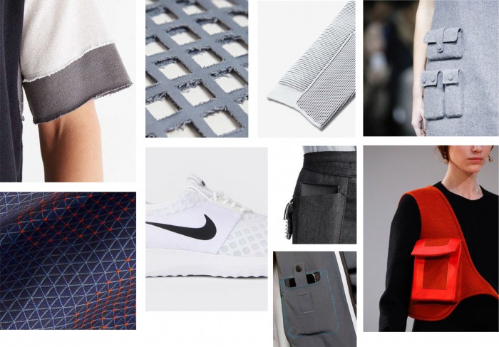
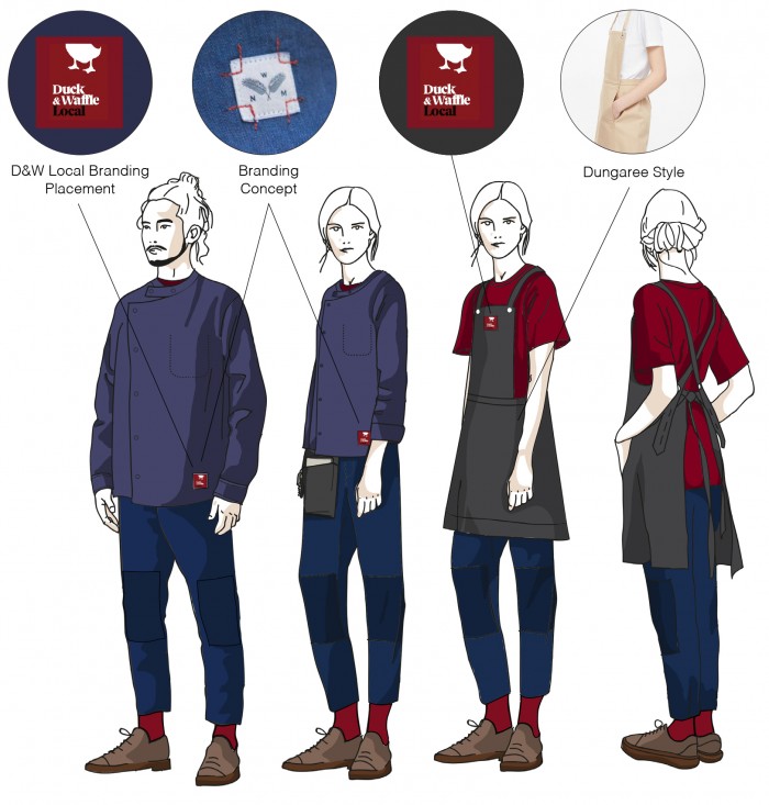
Our original designs for the brand used red, Duck & Waffle’s signature colour, as the basis of colour palettes – mixed with shades of blue and grey. We looked at how the logo could be used as embellishment in a classic way such as signature patches inspired by Carhartt.
Result
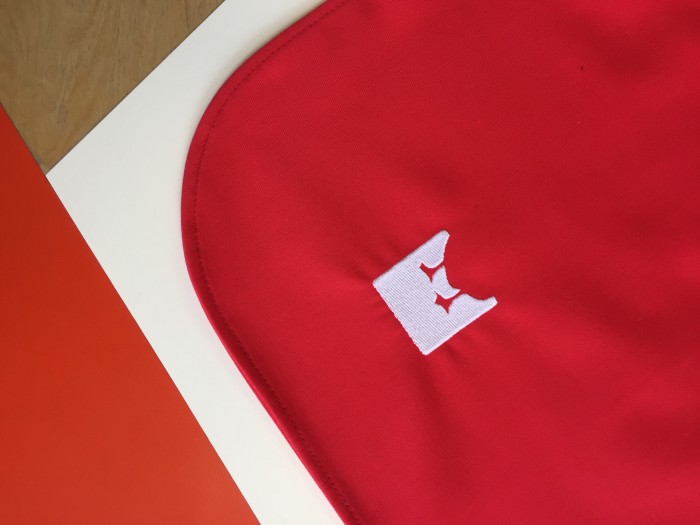
The final uniform features a statement red waist apron, with a unique curved hem; the large patch pocket is attached with metal rivets and a contrasting band and strap in burgundy. Finally, there is the cheeky embroidered Duck & Waffle Local logo.

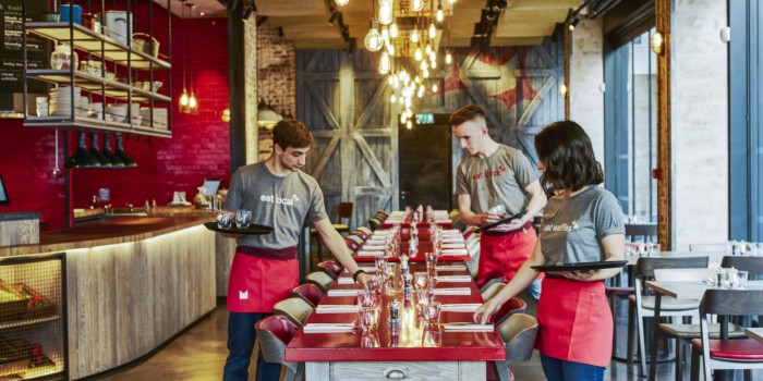
The team at D&WL are coupling the apron with complimentary light grey t-shirts printed with fun, approachable captions.
For more information about Duck and Waffle Local, visit their website.

